1
Friday, 30 March 2012
EVALUATION - Question 7
for this question i decided to do a video. unfortunalty, youtube decided not to allow me to log in or upload an video to link, so here it is in three stages, after alot of hastle and many emails !
Thursday, 29 March 2012
EVALUATION - Question 6
For this question i have decided to use 'beeclip'. it is a website that allows you to create a fun scrapbook.
Monday, 19 March 2012
EVALUATION - question 2
How does your media product represent particular social groups?
In this essay I will discuss how my music magazine represents its target social group.

here is an example of someone from my target social group. She is middle class, the average woman, Not to glamorous, the girl next door type.i have represented this in my images by having my model in nice clothes that arn't to showy, i have also posed my model very casual on my front cover, she is happy smiley and just having fun.
in my double page spread i have used marni. she is a young hopeful artist who has used determination and commitment to get to where she is today, she is an inspiration to other women who haven't got lots of money or contacts to work hard to stick to what they believe and one day there dreams will come true.
my texts and fonts also represent my aimed social groups. this is because they are simple, yet effective; they seem friendly, as a-posed to a large block font that could come across as aggressive and manly. for example


i then made a poster to advertise my product and using www.photofunia.com put it out into the streets!


in my double page spread i have used marni. she is a young hopeful artist who has used determination and commitment to get to where she is today, she is an inspiration to other women who haven't got lots of money or contacts to work hard to stick to what they believe and one day there dreams will come true.
my texts and fonts also represent my aimed social groups. this is because they are simple, yet effective; they seem friendly, as a-posed to a large block font that could come across as aggressive and manly. for example

or perhaps a font that is rocky and punk like, this could put women off and feel venerable

the colour of my font is also friendly and light hearted. its also a stereotypical womanly colour, its not hard hitting and forceful but soft and meaningful.

i chose this place to put up my advert because it portrays the social group of my auidence. they are not hard core parting and causing trouble they are civilized.
Monday, 12 March 2012
Monday, 27 February 2012
EVALUATION - question 1
in what ways does your product use. develop, or challenge forms and conventions of real media products?
to answer this question i have compared my contents page to a real one from a music magazine; where i got my inspirations from. this was the best example to show the similarities and differences between our magazines.
similarities in blue
differences in red

Monday, 20 February 2012
MUSIC MAGAZINE - Day 5
this is now my double page spread. i have made the fonts match to the speaker and added more text onto the other page. i have also added a quote by marni.

Monday, 6 February 2012
MUSIC MAGAZINE - Day 4
today i started to create my double page spread for my magazine and here is where i got too.


Monday, 30 January 2012
MUSIC MAGAZINE - Day 3
in photoshop i managed to lighten the image so it wasn't to dingy and now fits in very well will the key of the front cover. i also edited out the line of the P going through Marni's shoe and it now looks more appealing and a lot more professional.

as you can see the line has gone!

as you can see the line has gone!
MUSIC MAGAZINE - Day 3
this is the first copy of my contents page. i have used 3 main features and talked about them in more detail (these are my cover lines) i then added some more page tags below. i also included a line at the bottom of the page to fill the gap and took the opportunity to include a sneak peak for the next issue.

i am now going to use photo shop to edit and correct detail.
Monday, 23 January 2012
MUSIC MAGAZINE - Day 2
In todays lesson i completed the design of my front cover. i added new texts, coverlines, a barcode and the price.

overall i am very happy with my front cover. it portrays the style of music it includes and uses most magazine conventions.
Monday, 16 January 2012
Music MAGAZINE - day 1
when trying to upload my images i had a real problem with converting them from a nikon RAW file .NEF to a .JPEG. however after a long process we managed to get them up and running. so far i have done the mast head and cover image. and began on my coverlines.


i chose the font for the mast head because it fits with the title itself not to swirly and not to block, like a pulse on a reader. i picked a deep purple for the colour as its bold but not agressive and overpowering, altough its dark its still quite warming. i started to work on my coverlines making things exclusive to my magazine but i havn't yet chosen a colour or font.
Monday, 9 January 2012
MUSIC MAGAZINE - proposal
my music magazine will be a R&B themed with a target audience of females ages 15-23. you will be able to tell by who i will feature and the colour scheme who i will be aiming for.
After deciding on this i had to think of naming the magazine. i came up with RYHTM, PULSE and Beat, and after contemplating on what goes best with the genre, font ideas and possible tag lines; I Chose PULSE. these taglines were...
On the front cover i will include a medium close up image of one of my friends, she will be looking directly at the camera. i want her to have very curly almost afro hair and dark smoky eye make up, i want her to be wearing a dress of some sort that is daring yet classy.

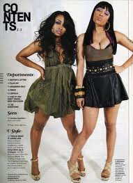
My contents page will include the same person with a different outfit, this image will be the full body shot down the side, or perhaps a laying down shot like these.


my double page spread will include a more casual look either sat on a chair or the floor and looking very smiley. something like the image below but not so serious.

After deciding on this i had to think of naming the magazine. i came up with RYHTM, PULSE and Beat, and after contemplating on what goes best with the genre, font ideas and possible tag lines; I Chose PULSE. these taglines were...
On the front cover i will include a medium close up image of one of my friends, she will be looking directly at the camera. i want her to have very curly almost afro hair and dark smoky eye make up, i want her to be wearing a dress of some sort that is daring yet classy.

My contents page will include the same person with a different outfit, this image will be the full body shot down the side, or perhaps a laying down shot like these.

my double page spread will include a more casual look either sat on a chair or the floor and looking very smiley. something like the image below but not so serious.

the fixed price we have come to is £2.50. as the magazine will include poster of the feature artist. however it will not include all the extras you get when you purchase a magazine such as cosmo which is £3.
MUSIC MAGAZINE - rule of thirds
when taking images you must use the rule of thirds. This a gird that can be made to appear on you camera. the rule is very important when taking magazine images because it allows you to arrange the image according to the size of the masthead and coverlines.
here is an example

here is an example

Subscribe to:
Posts (Atom)